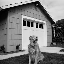
The path leading to the nursery as it looks now was a little something like this:
"Oooh! Ohh. Ahhh...! Oooooooooh!!" edit * edit * edit * and then more: "Ooh, but this?! Oh definitely... Love! But where would it go? Cute!" edit * edit * edit * and so on. That's right, lots and lots of good stuff out there, but only so much space for it all, and more importantly, there is only so much real esate for smaller items and accessories in Modern Cottage design before we back away and go "Oh - too much. Pare down and keep it simple".
We're thrilled with our final design and feel we edited just right to fit the space and achieve the feeling we were going for. That said, we discovered loads of great nursery items along the way. Here are a few of them.
1. Bird light by Perch (in white, of course). Really wanted to use this but ultimately felt it would be one too many items in there. It's just so cool.
2. Adorable sock dogs (and other animals) by Scooter and Goose on Etsy. So sweet.
3. This growth chart is perfect. Based on a vintage ruler. Cool, right? It's so simple and understated it could go almost anywhere and surely doesn't look like it was plucked from a playroom. Extra points there.

4. This truck pillow plays to our affection for old pick up trucks.
5. Toys in the shapes of oversized utensils - so charming. I'm all about this fork in natural linen.
6. Animal pyramid art!
7. Of course we also love Collette Bream's pillows ...

8. ...and this awesome Eames elephant (both of which we've already drooled over in earlier posts).
If you're planning a new nursery space or looking for some ways to freshen up your kids' rooms, we hope this provides a little Modern Cottage inspiration!


No comments:
Post a Comment