Showing posts with label modern farmhouse. Show all posts

Thursday, July 20, 2017

House tour


Our latest project pulled inspiration from a few (juxtaposed) places - modern/timeless, urban/rural, and warm/minimal. We also drew inspiration from some of the incredible homes in Park City, a place we love to visit each summer. The dominant design principle however stayed true to the Modern Cottage style - clean and simple, where function and beauty unite. We're affectionately calling this project Luxe Utility.

Here's a look.


Our favorite friend, the Viking range. Such a dashing gent.

I will not get into the drama that became mounting these floating shelves. All I will say is... they turned out great! And I put my little white sconce on a dimmer for the sweetest kitchen night light ever.

We hand-picked the carrara per usual. We really love these pieces. They had a bit more grey than normal which works so perfectly in here. And I'm not going to lie- we eyeballed all the light fixtures in our own house before installation to see what we might like to change out. How can you not? One of my favorite lighting curations for sure.

Huge island - I am a wee bit jealous. Just. So. Much. Room... for cookie baking! You can really spread everything out. 


And yes, those are site-finished solid oak floors per usual - we just cannot get on board with the engineered trend.


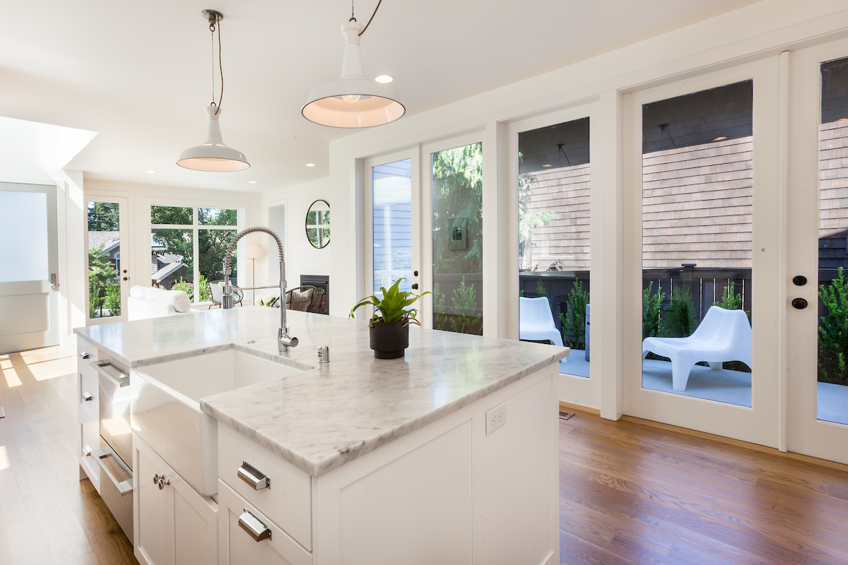
We also blew the  budget on lighting - but you do what you gotta do to get the look just right.


Probably the first and last time we install this Kohler sink due to drain compatibility issues (the only one that works - from a Canadian manufacturer - is apparently being discontinued!). I am so smitten though. And because I can't stand to build a house that doesn't function 110%, I searched far and wide for a way to provide hand soap without adding a bulky shelf. I thought about recessing it into the tile wall but it was full of backing for the wall-mount sink. I tabled and revisited the hunt a few times, and in the end, I found this amazing steel holder and soap bottle from Denmark. It is one of my favorite things in the entire house! It's the little things.


And, the vintage lights. Checked and re-wired of course, and professionally installed. I am a wee bit jealous on this count, too. Thought long and hard about where to put in our own house, but alas, I did source them for this project, and they work so perfectly in the stairway. Ok, soap and sink and lights. My short list of loves. Railing is pretty great, too. We used all flat stock to keep it visually light.


Oh, right... and master bath. Sooooo much love. Solid hickory cabinets did the trick. Again, not on board with the wood-look laminate cabinets that are so popular right now. The purist in me, I guess. And: durability. I want these to look good for a long time.


This project was especially fun because we built a separate detached structure known here as an ADU or Accessory Dwelling Unit. It's like a studio apartment that can be a legal rental if desired.

The studio apartment is above the two-car garage. Such a great flex space for guests, teens, nanny, or it would make an incredible office.

Inside the ADU. We finished out the bathroom and roughed in for kitchen and laundry.

The mood of this house is crazy cool - so fresh, bright and cheerful. We just love it.

The clear cedar channel accents were definitely a splurge - but I took one look at the knotty stuff and knew it would not fit the design. Clear cedar it is!  Husband knew in advance I'd pass on the tight knot but indulged me because he knows I like to see all options. The channel style means the boards are stacked vs beveled - a great modern look.


We always love ourselves a little lime-hued smoke tree - the color is so perfect! We also found these amazing chartreuse holly which we loaded up on, and a few narrow aspens (we love the way the leaves flutter in the breeze).

We think it's pretty dreamy.


Did I mention what we started with? This tiny, 560 square foot structure. It was carefully deconstructed to studs until we were left with a couple partial walls and a portion of the foundation. This was necessary to achieve our architectural design given the constraints of the narrow lot. So the detached garage and ADU are newly constructed, and the house is considered a major addition/remodel.


Sunday, November 3, 2013

House Tour

This sweet little farmhouse is just as happy inside as it is outside. But first, let's revisit the exterior:

Classic farmhouse details are reinterpreted in a modern way: smooth beveled siding, gridded windows, industrial  barn lights, and a half-light French door feel fresh and familiar.
We spent a lot of time getting the floor plan and exterior elevations just right while working with the constraints of the narrow lot and existing structure. We are so happy with the end result for its architectural significance, authentic details, and beautiful form.
The black and white exterior is punctuated with raw silver-tone accents through metal roofing, galvanized gutters with round downspouts, and galvanized barn lights.
We think the best part is that this home is just enough - it's not excessive in size or scale, but has incredible functionality within its 1,633 square feet. It's finished simply but beautifully, with an emphasis on quality and function: The Modern Cottage way :)
The original old-growth CVG fir floors got new life with a sanding, staining, and resealing. Horizontal planking was added to the fireplace wall for added interest. The minimalist fireplace surround offers understated elegance and a purity of design which is consistent throughout the house.


One of the best things about this house is all the amazing sight lines - you can see almost all the way from the front of the house to the back on each level. The living room, kitchen, and dining room mingle nicely yet retain their independence.
The kitchen in stainless, white, carrara, and chrome, with that saturated chocolate floor for contrast and warmth. Opening all the lighting packages was like Christmas morning for me. I am in love with these pendant lights (and currently figuring out where in our own house we can incorporate them).
Because the kitchen is not huge, we added a second bank of cabinets on the opposite wall, including a microwave cubby (because it can be such a counterspace stealer if it doesn't have a designated, built-in home). This way you get extra counterspace too which will be nice for serving and entertaining. We also carved out a large walk-in pantry for both food and kitchen overflow items (small appliances, large pots and pans, etc.) It's tucked just out of sight, behind the fridge.
 I think this six-burner Viking is the most adorable little range ever. The silver knobs are such a great update from the black ones on older models. We took the subway tile to the ceiling and left the rest of this wall clean.
The short raised bar creates a slight separation from the living room and keeps any clutter invisible from the front door.
 We went with 7-foot doors which really promote maximum light and a real sense of volume and loft. Love the chemistry between the kitchen and dining room.
This soft, textural pendant was chosen to soften up the space. The bay window with option for bench seat feels cozy.
A glossy floating vanity for the main floor bath, with a rusty metal mirror for contrast. Outdoor barn light became indoor bath sconce :)
The main floor third bedroom can easily function as a family room or guest suite. We put a lot of windows in this house, and it was totally worth it!
This little space has a large closet for the washer and dryer, plus a great storage cabinet. 
The metal stair rail turned out so well - it was custom fabricated and feels just the right amount of simple and modern.
Upper level loft - white on white plus tons of windows and skylights equals one of the most invigorating, dreamy spaces you can imagine!
And it doesn't hurt that the oversized picture window (on the right) dispenses loads of southern sunlight.
With its vaulted ceilings and tree views, the master bedroom feels pure and organic. We repeated the textural pendant here since I loved it so much, and also because we like to have consistency in design when finishing out a smaller home.
The way we jogged the floor plan also left us the opportunity to capture some view and western orientation, even though this room is at the back of the house.
Cararra and subway tile continue in the master, with vaulted ceilings and a rustic/modern mix. The mirror we made ourselves. I wanted a hit of raw wood in this room for texture and interest. The color (achieved with a vinegar/steel wool solution) feels perfectly farmhouse.
And I love the sleek lines of this faucet, though it's not over the top modern.
The second bedroom (this used to be the only bedroom!) retains original charm.
A dormer opens things up a ton. The barn door was added to keep sight lines open, and just for fun!
Last, the third bathroom (also part of the original structure - it used to be a small den). We repeated the floating vanity and barn sconce, and changed up the mirror (a great CB2 find). Fitting built-in storage on the opposite wall makes use of otherwise wasted space... and is great for kids!
Thanks for following our Modern Farmhouse project and taking this tour with us! We hope we've offered some fun inspiration and new ideas.